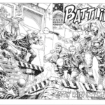
As soon as we saw Matt Hoskins announce that he had completed his MOONIVERSE series of artworks over on Twitter last week, we obviously have to reach out to him to get higher resolution versions of each of these beautiful creations for you all to admire. We also wanted to know a bit more about the process and inspiration. Luckily for us Matt sent over the images AND wrote a bit for you all to read too, which is nice 🙂
Over to Matt to tell you all about it…
I began creating the Mooniverse trilogy artwork as part of a small informal competition that Duncan organised to design a DVD cover for MUTE (since being a Netflix film, wouldn’t be available in physical form). Knowing that MUTE and MOON were connected, I decided to redesign the MOON cover and then extrapolate the technique to the MUTE design.
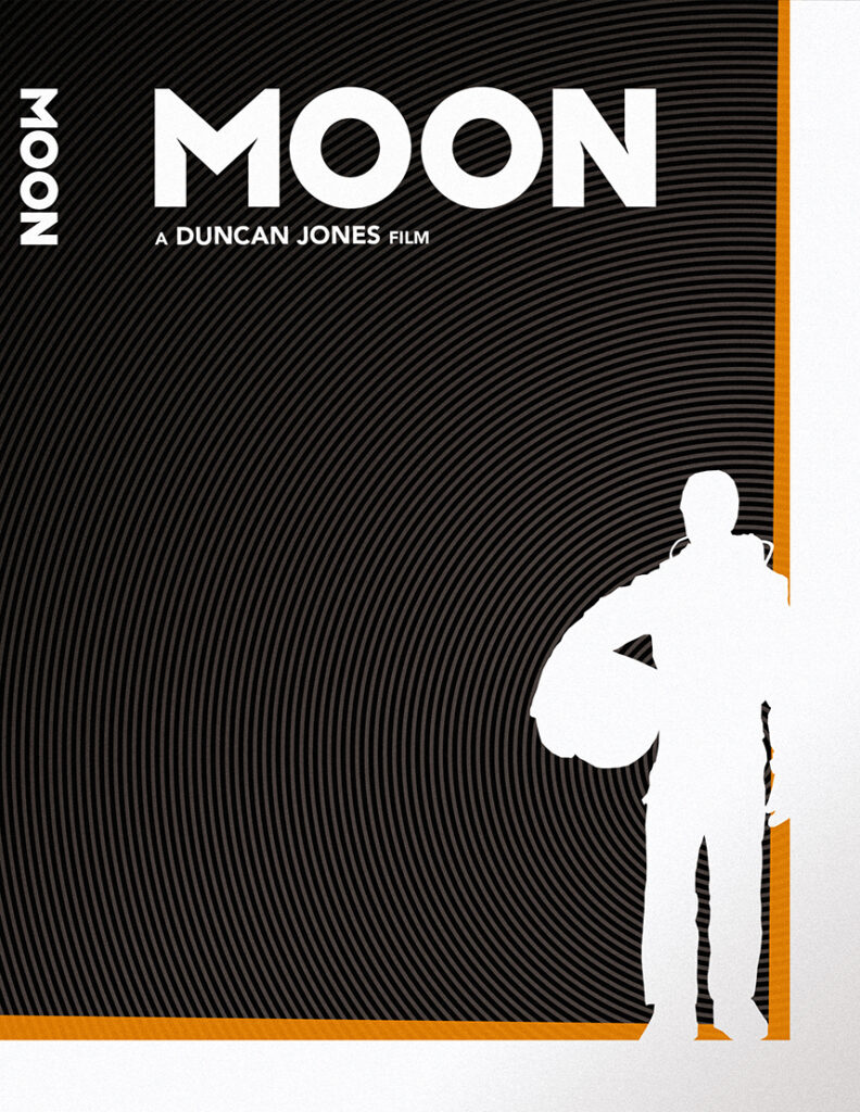
My general design style is vector-based, allowing for clean, exact lines. It is said that a good character design is recognisable in just its silhouette, so I decided to prove it by reducing the Sam Bell and Leo characters to just that.
To translate the concentric circle background from MOON to the MUTE design, I took inspiration from a photo of MUTE, where there are chevron neon signs in the background. This is also the source of Leo’s silhouette.
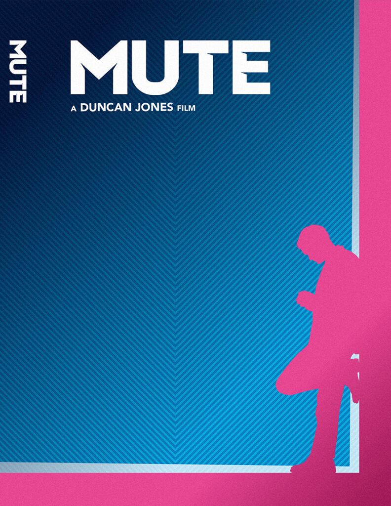
The colour schemes for the two designs have very simple origins – MOON gains its colours from Lunar Industries, whilst MUTE’s extreme neon signs provide the second scheme.
I also adapted the original MUTE text logo, with its small nicks cut out from select corners, to create a new MOON logo to further tie the designs together.
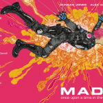
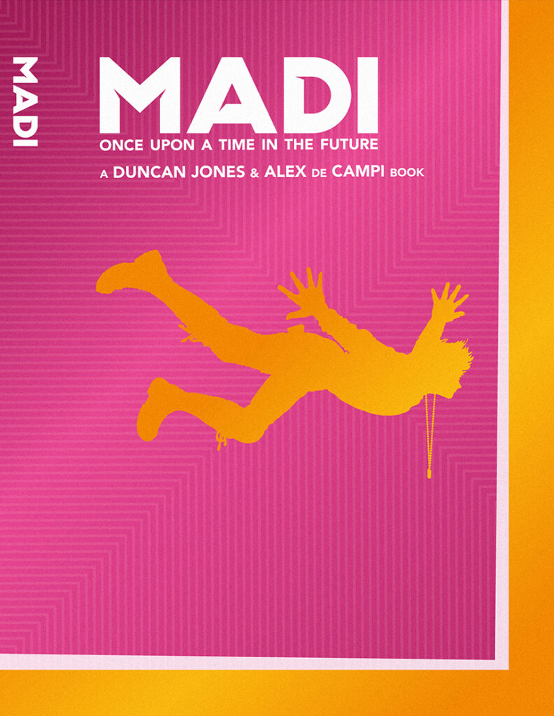
My two designs were well received in the competition, and I was very pleased with them myself. Fast forward a couple of years, and the designs popped up on several social media notifications since it has just been the anniversary of the release of MUTE. So, I reacquainted myself with the designs and repeated the technique to create the MADI poster, using the iconic free fall silhouette, and bright pink and orange cover colour scheme from the graphic novel that coincidentally are also used in the other two. All in all a very satisfying result and I am also happy that Duncan likes them too!
Duncan does indeed love them, employing the internationally recognised expression of love and amazement that is a Gif of Hugh Jackman from The Fountain in recognition.
We all love them, Matt. Amazing work, thank you so much for sharing them with us all and for letting us know all about the creation.
More design work from Matt over on his Behance page.